Categories
opinion pubs

QUICK ONE: The Ubiquity of Coastal Chic

Sign outside the First & Last: New Look, New Menu, New Team.

Pubs in Cornwall are ditching the cosy smugglers’ den look for airy-and-aspirational, and it doesn’t always work.

On Saturday we went for a walk to Land’s End looping back to check out The First & Last, a pub we usually end up visiting a couple of times a year. Having closed for a time it has now re-opened after a refurbishment, and under new management.

We used to find it pretty decent: there were always a couple of beers worth drinking, it was snug in winter, and had a fairly bin-free garden for when the sun happened to be shining. The refurb hasn’t been drastic and most of that still applies — the beer, in fact, is better — but we reckon the attempt to brighten it up has taken away some essential character.

Things have been painted light teal — why is it always teal? — and there are more bare surfaces. It doesn’t look bad, as such, but it’s not what we’re looking for in a pub caught between moorland and rugged cliffs.

We’ve seen a few other makeovers like this, too, most notably The Sir Humphrey Davy here in Penzance.

Cornwall’s problem (and maybe this applies to Devon, too) is that it is really two different places depending on the weather: on a sunny high-season day, an artfully gloomy pub with wood and low beams is no use to anyone. Equally, when it’s dark at 4pm, raining and blowing a gale, a pub decorated in beach hut colours, tiled and metal-trimmed, can feel like a morgue. At the moment, the trend is, quite understandably, to cater to the lucrative summer trade.

The thing is, though decor can give a slight lift, it can’t make light where there is none: at The First & Last, the windows are still low, small and facing west, and it still felt dark.

It’s not always a disaster. At the Old Coastguard in Mousehole — perhaps the inspiration for some of these other makeovers — it works, because the light floods in through huge windows at the back of the pub, with no obstructions as the garden slopes down to the sea.

We can’t help thinking, though, that some pubs ought to accept that, through circumstances of location, history and architecture, they are destined to be Cosy Old Inns, and just double-down on it. If the pub lacks light, then give up and make a feature of shadowy corners. If it feels cluttered, get more and more intriguing rubbish to fill any gaps. If it looks old-fashioned, don’t waste time trying to be hip: settle into it.

‘Contemporary’ ages fast; snug is eternal.

Categories
marketing opinion

Infantile?

Label for Partizan X ale w. crossed dinosaurs.
Art by Alec Doherty. SOURCE: Partizan Brewing Archive.

We’re working on an article about mild in the 21st century, research for which prompted this statement in an email from Andy Smith at Partizan:

The beer was originally simply called mild… We then decided to rebrand as X… This worked OK but not as well as we’d hoped. It was at this stage we put dinosaurs on the label and sales rocketed! I kid you not. It sells as well if not better now as our other dark beers. Dinosaurs! Now we spend our weekends hearing how cute the dinosaurs are (recently changed) and  answering the question what is X?

That’s funny, of course, but also made us think, ‘Huh. So craft beer drinkers are like children?’

We’ve observed before, as has almost everyone else who’s written a tedious think-piece on the subject, that craft beer in cans has been successful partly because they are tactile and colourful, bright and toy-like. Beavertown Brewery’s cartoon-laden designs in particular suggest material for an (admittedly slightly weird) animated series and also make them look like a bit like soft drinks. (Gamma Ray more so than this example we have at hand.)

Beavertown Smog Rocket design.
Art by Nick Dwyer. Source: Beavertown Brewery.

And sometimes, with fruit and residual sweetness and novelty flavourings and higher carbonation, the hippest beers can taste a bit like soft drinks too.

Of course we checked ourselves fairly promptly: one person’s infantile is, of course, another person’s fun, and we understand that you humans enjoy this emotion fun is good.

And even if it is infantile, is that a bad thing? One key reason people drink is to reduce the pressures of adult life and the pub is where grown-ups go to play.

This is a question we’re going to have in mind from now on, though, especially when we find ourselves considering the generation gap between real ale culture and craft beer. (Def 2.)

Categories
marketing

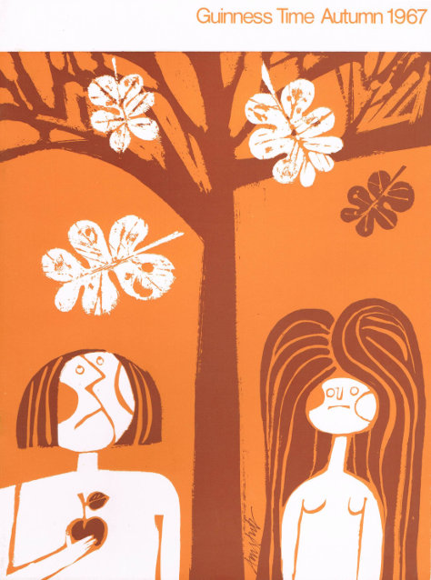
GALLERY: Guinness Time, 1967-1971

These wonderfully colourful covers for editions of the Guinness London staff magazine remind us of cartoons and children’s books from our childhoods, but could just as easily grace the sleeve of a Kinks LP.

Autumn 1967, front: Adam and Eve with the apple.
Autumn 1967, front.
Autumn 1967, rear: the Edenic serpent wraps itself around a bottle of Guinness.
Autumn 1967, rear.
Categories
Beer history pubs

The Renaissance of the English Public House

Basil Oliver’s The Renaissance of the English Public House was published in 1949 1947 and argues that the period between the two World Wars was a golden age of pub design and building.

Cover: The Renaissance of the English Public House.It is printed on post-war paper (rough and yellowing) but is crammed with photographs and floor-plans of specific pubs up and down the country.
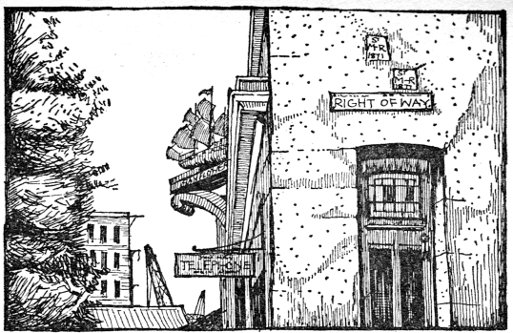
In his introduction, Oliver observes that, in the period before World War I, new pub buildings were rare because of the ‘misguided idea… that to improve buildings was to encourage drinking’. He observes, however, that the prohibitionist urge actually triggered a great resurgence in pub design and building: when the state began to run the brewing and pub industry in Carlisle in 1916, ‘it permitted unhampered experiments in many directions, but especially in the evolution of the public house’.

County Arms, Blaby, near Leicester.

An entire chapter of the book is given over to the Carlisle State Management scheme. During WWI, Oliver says, improvements were limited: the removal of hard-to-supervise snugs and ‘snuggeries’ (small compartments) to create ‘light and airy cheerfulness’. After the war, new buildings were commissioned, including The Gretna Tavern, which replaced (Oliver reckons) six ‘snug-type houses’. We could not help but think of Wetherspoon’s.

Away from specific pubs, the more general detail Oliver provides on contemporary pub culture offer a useful companion piece to the Mass Observation book The Pub and the People. On alternative names for the ‘public bar’, he observes that ‘Tap Room’ is out of fashion, and…

Saloon Bar has a faint suggestion of superiority, and is the haunt of the ‘toffs’ (or would-be toffs) but even they frequently require the inevitable darts-board. Smoking Room… is also popular…. Private Bar and Bar Parlour… are equally indicative of their purpose — private transactions and intimate conversations — and from being popular with the fair sex have virtually become, in many houses, a Women’s Bar.

The last, lingering remains of Victorian morality can be detected in a coy discussion of toilets: ladies’ and gentlemen’s lavatories, he insists, must be apart from each other, secluded, but also easy to supervise. (The horrifying fact that people of both sexes piss must be kept secret, but there should be no opportunities for hanky-panky either.) Even today, it occured to us, the easiest way to find the ladies’ toilet is usually to walk as far from the gents’ as possible, and vice versa.

As for beer, Oliver is quite clear: ‘From the consumer’s point of view, the ideal way of receiving his beer is direct “from the wood”, and — on a hot summer’s day — from a very cool cellar.’ Cellars, he suggests, should be cut off from the outside world, running with damp, have earth floors, and be exposed as much as possible to the cool soil beyond their walls. The ideal, he concedes, is rarely possible:

More likely is it that new ways of drawing draught beer will be invented for conditioning draught beer which will eliminate all the complicated paraphernalia of beer engines, air-pressure installations, flexible pipes…

The grand ‘Tudor mansions’ of Mitchells & Butlers in Birmingham are also granted a chapter of their own, highlighting the advantages to brewers of building on new sites rather than restoring old pub buildings: restaurants, car parks, gardens, and even bowling greens were common. London gets a chapter of its own, too, with the rest of the country, from Liverpool to Devon, wrapped up in two more general surveys of urban and ‘wayside’ pubs.

We spent a bit of time looking up pubs mentioned on Google Street View. Many are gone altogether. Others were rebuilt on the same scale but with less style. A few remain, but often defaced with plastic banners, ugly signage, and accumulated grime: the Apple Tree in Carlisle, featured in the big image at the top, is now ‘Pippins‘, and still a handsome building.

For a rather specialised, technical book, Oliver’s prose is very readable, with the occasional amusing turn of phrase and impassioned diatribe. We paid around £20 for our copy, which is not in great condition, but it isn’t rare or hard-to-find. Depending on how interested you are in the detail of pub design and/or this particular period, that might seem a bit steep, but we enjoyed it.

Categories
london pubs

The Lost art of Drawing Pubs

In the nineteen-sixties and seventies, there was a flood of books about pubs, many of which included illustrations.

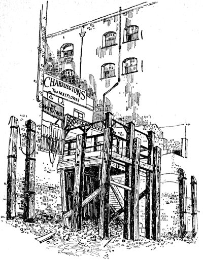
London Pubs by Alan Reeve-Jones (1962) has many lovely drawings by artist Miriam Macgregor, who went on to become a well-respected engraver. Her rendition of the Mayflower in Rotherhithe is below.

The Mayflower pub, Miriam Macgregor, 1962.

When Assheton Gorton provided drawings of pubs for the 1973 edition of Martin Green and Tony White’s Evening Standard Guide to London Pubs, he also tackled the Mayflower.

The Mayflower pub by Assheton Gorton, 1973.

Both of the above are interesting and entertaining books, which cannot, unfortunately, be said of The Alka-Seltzer guide to the Pubs of London (1976). Its illustrations, by ‘Myerscough’, are quite nice, though. He, she or it unfortunately ignored the Mayflower, but instead created a block print of the nearby Angel at Bermondsey.

The Angel pub, Myerscough, 1976.

As colour printing got cheaper, beer books and pub guides became home to a certain kind of tasteful, arty photography, and illustrations like these became less common. These days, they tend to be filled with free images, snapped by the author on a phone or digital camera, or borrowed from the internet. That seems a shame.

Note: we’ve reproduced the images above in low-resolution for, er, illustrative purposes, and will remove them if asked to do so by copyright holders.